现代 CSS 高阶技巧,不规则边框解决方案
本文是 CSS Houdini 之 CSS Painting API 系列第四篇。
- [现代 CSS 之高阶图片渐隐消失术[1]]
- [现代 CSS 高阶技巧,像 Canvas 一样自由绘图构建样式![2]]
- [现代 CSS 高阶技巧,完美的波浪进度条效果![3]]
在上三篇中,我们详细介绍了 CSS Painting API 是如何一步一步,实现自定义图案甚至实现动画效果的!
在这一篇中,我们将继续探索,尝试使用 CSS Painting API,去实现过往 CSS 中非常难以实现的一个点,那就是如何绘制不规则图形的边框。
CSS Painting API
再简单快速的过一下,什么是 CSS Painting API。
CSS Painting API 是 CSS Houdini 的一部分。而 Houdini 是一组底层 API,它们公开了 CSS 引擎的各个部分,从而使开发人员能够通过加入浏览器渲染引擎的样式和布局过程来扩展 CSS。Houdini 是一组 API,它们使开发人员可以直接访问 CSS 对象模型[4] (CSSOM),使开发人员可以编写浏览器可以解析为 CSS 的代码,从而创建新的 CSS 功能,而无需等待它们在浏览器中本地实现。
CSS Paint API 目前的版本是 CSS Painting API Level 1[5]。它也被称为 CSS Custom Paint 或者 Houdini's Paint Worklet。
我们可以把它理解为 JS In CSS,利用 JavaScript Canvas 画布的强大能力,实现过往 CSS 无法实现的功能。
过往 CSS 实现不规则图形的边框方式
CSS 实现不规则图形的边框,一直是 CSS 的一个难点之一。在过往,虽然我们有很多方式利用 Hack 出不规则图形的边框,我在之前的多篇文章中有反复提及过:
- [有意思!不规则边框的生成方案[6]]
- [CSS 奇技淫巧 | 巧妙实现文字二次加粗再加边框[7]]
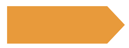
我们来看看这样一个图形:
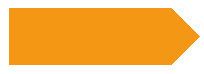
<div class="arrow-button"></div>
.arrow-button {
position: relative;
width: 180px;
height: 64px;
background: #f49714;
&::after {
content: "";
position: absolute;
width: 32px;
height: 64px;
top: 0;
right: -32px;
background:
linear-gradient(-45deg, transparent 0, transparent 22px, #f49714 22px, #f49714 100%),
linear-gradient(-135deg, transparent 0, transparent 22px, #f49714 22px, #f49714 100%);
background-size: 32px 32px;
background-repeat: no-repeat;
background-position: 0 bottom, 0 top;
}
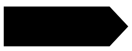
}但是,如果,要实现这个图形,但是只有一层边框,利用 CSS 就不那么好实现了,像是这样:
- 借助 filter,利用多重
drop-shadow() - 借助 SVG 滤镜实现
我们快速回顾一下这两个方法。
借助 filter,利用多重 drop-shadow() 实现不规则边框
还是上面的图形,我们利用多重 drop-shadow(),可以大致的得到它的边框效果。代码如下:
div {
    position: relative;
    width: 180px;
    height: 64px;
    background: #fff;

    &::after {
        content: "";
        position: absolute;
        width: 32px;
        height: 64px;
        top: 0;
        right: -32px;
        background:
            linear-gradient(-45deg, transparent 0, transparent 22px, #fff 22px, #fff 100%),
            linear-gradient(-135deg, transparent 0, transparent 22px, #fff 22px, #fff 100%);
        background-size: 32px 32px;
        background-repeat: no-repeat;
        background-position: 0 bottom, 0 top;
    }
}
div {
    filter:
        drop-shadow(0px 0px .5px #000)
        drop-shadow(0px 0px .5px #000)
        drop-shadow(0px 0px .5px #000);
}
可以看到,这里我们通过叠加 3 层 drop-shadow(),来实现不规则图形的边框,虽然 drop-shadow() 是用于生成阴影的,但是多层值很小的阴影叠加下,竟然有了类似于边框的效果:
借助 SVG 滤镜实现实现不规则边框
另外一种方式,需要掌握比较深的 SVG 滤镜知识。通过实现一种特殊的 SVG 滤镜,再通过 CSS 的 filter 引入,实现不规则边框。
看看代码:
<div></div>

<svg width="0" height="0">
    <filter id="outline">
        <feMorphology in="SourceAlpha" result="DILATED" operator="dilate" radius="1"></feMorphology>
        <feMerge>
            <feMergeNode in="DILATED" />
            <feMergeNode in="SourceGraphic" />
        </feMerge>
    </filter>
</svg>
div {
position: relative;
width: 180px;
height: 64px;
background: #fff;
&::after {
content: "";
position: absolute;
width: 32px;
height: 64px;
top: 0;
right: -32px;
background:
linear-gradient(-45deg, transparent 0, transparent 22px, #fff 22px, #fff 100%),
linear-gradient(-135deg, transparent 0, transparent 22px, #fff 22px, #fff 100%);
background-size: 32px 32px;
background-repeat: no-repeat;
background-position: 0 bottom, 0 top;
}
}
div {
filter: url(#outline);
}简单浅析一下这段 SVG 滤镜代码:
<feMorphology in="SourceAlpha" result="DILATED" operator="dilate" radius="1"></feMorphology>将原图的不透明部分作为输入,采用了 dilate 扩张模式且程度为 radius="1",生成了一个比原图大 1px 的黑色图块- 使用 feMerge 将黑色图块和原图叠加在一起
- 可以通过控制滤镜中的 radius="1" 来控制边框的大小
这样,也可以实现不规则图形的边框效果:
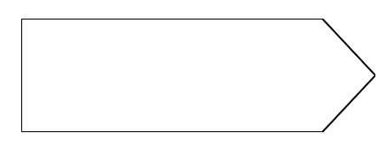
利用 CSS Painting API 实现不规则边框
那么,到了今天,利用 CSS Painting API ,我们有了一种更为直接的方式,更好的解决这个问题。
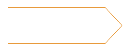
还是上面的图形,我们利用 clip-path 来实现一下。
<div></div>
div {
position: relative;
width: 200px;
height: 64px;
background: #f49714;
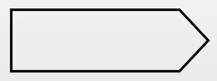
clip-path: polygon(85% 0%, 100% 50%, 85% 100%, 0% 100%, 0% 0%;);
}我们可以得到这样一个图形:
clip-path 的参数,其实完全也可以利用 CSS Painting API 的 borderDraw 来绘制这个图形。
我们尝试一下,改造我们的代码:
<div></div>
<script>
if (CSS.paintWorklet) {
   CSS.paintWorklet.addModule('/CSSHoudini.js');
}
</script>
div {
position: relative;
width: 200px;
height: 64px;
background: paint(borderDraw);
--clipPath: 85% 0%, 100% 50%, 85% 100%, 0% 100%, 0% 0%;);
}这里,我们将原本的 clip-path 的具体路径参数,定义为了一个 CSS 变量 --clipPath,传入我们要实现的 borderDraw 方法中。整个图形效果,就是要利用 background: paint(borderDraw) 绘制出来。
接下来,看看,我们需要实现 borderDraw。核心的点在于,我们通过拿到 --clipPath 参数,解析它,然后通过循环函数利用画布把这个图形绘制出来。
// CSSHoudini.js 文件
registerPaint(
    "borderDraw",
    class {
        static get inputProperties() {
            return ["--clipPath"];
        }

        paint(ctx, size, properties) {
            const { width, height } = size;
            const clipPath = properties.get("--clipPath");
            const paths = clipPath.toString().split(",");
            const parseClipPath = function (obj) {
                const x = obj[0];
                const y = obj[1];
                let fx = 0,
                    fy = 0;
                if (x.indexOf("%") > -1) {
                    fx = (parseFloat(x) / 100) * width;
                } else if (x.indexOf("px") > -1) {
                    fx = parseFloat(x);
                }
                if (y.indexOf("%") > -1) {
                    fy = (parseFloat(y) / 100) * height;
                } else if (y.indexOf("px") > -1) {
                    fy = parseFloat(y);
                }
                return [fx, fy];
            };

            var p = parseClipPath(paths[0].trim().split(" "));
            ctx.beginPath();
            ctx.moveTo(p[0], p[1]);
            for (var i = 1; i < paths.length; i++) {
                p = parseClipPath(paths[i].trim().split(" "));
                ctx.lineTo(p[0], p[1]);
            }
            ctx.closePath();
            ctx.fill();
        }
    }
);
简单解释一下上述的代码,注意其中最难理解的 parseClipPath() 方法的解释。
- 首先我们,通过
properties.get("--clipPath"),我们能够拿到传入的--clipPath参数 - 通过
spilt()方法,将--clipPath分成一段段,也就是我们的图形实际的绘制步骤 - 这里有一点非常重要,也就是
parseClipPath()方法,由于我们的-clipPath的每一段可能是100% 50%这样的构造,但是实际在绘图的过程中,我们需要的实际坐标的绝对值,譬如在一个 100 x 100 的画布上,我们需要将50% 50%的百分比坐标,转化为实际的50 50这样的绝对值 - 在理解了
parseClipPath()后,剩下的就都非常好理解了,我们通过ctx.beginPath()、ctx.move、ctx.lineTo以及ctx.closePath()将整个--clipPath的图形绘制出来 - 最后,利用
ctx.fill()给图形上色
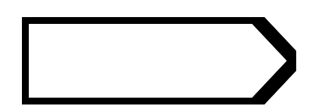
这样,我们就得到了这样一个图形:
简单改造一些 JavaScript 代码的最后部分:
// CSSHoudini.js 文件
registerPaint(
"borderDraw",
class {
static get inputProperties() {
return ["--clipPath"];
}
paint(ctx, size, properties) {
// ...
ctx.closePath();
// ctx.fill();
ctx.lineWidth = 1;
ctx.strokeStyle = "#000";
ctx.stroke();
}
}
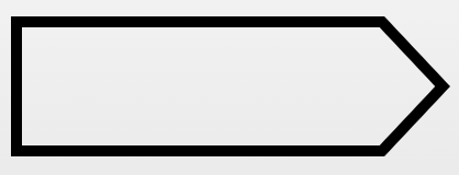
);这样,我们就得到了图形的边框效果:
仅仅利用 background 绘制的缺陷
但是,仅仅利用 [bacg](background: paint(borderDraw "bacg")) 来绘制边框效果,会有一些问题。
上述的图形,我们仅仅赋予了 1px 的边框,如果我们把边框改成 5px 呢?看看会发生什么?
// CSSHoudini.js 文件
registerPaint(
    "borderDraw",
    class {
        static get inputProperties() {
            return ["--clipPath"];
        }
        paint(ctx, size, properties) {
            // ...
            ctx.lineWidth = 5;
            ctx.strokeStyle = "#000";
            ctx.stroke();
        }
    }
);
此时,整个图形会变成:
因此,我们需要换一种思路解决这个问题,继续改造一下我们的代码,仅仅需要改造 CSS 代码即可:
div {
    position: relative;
    width: 200px;
    height: 64px;
    margin: auto;
    clip-path: polygon(var(--clipPath));
    --clipPath: 85% 0%, 100% 50%, 85% 100%, 0% 100%, 0% 0%;

    &::before {
      content:"";
      position:absolute;
      inset: 0;
      mask: paint(borderDraw);
      background: #000;
    }
}
这里,我们的元素本身,还是利用了 clip-path: polygon(var(--clipPath)) 剪切了自身,同时,我们借助了一个伪元素,利用这个伪元素去实现具体的边框效果。
这里其实用了一种内外切割的思想,去实现的边框效果:
- 利用父元素的
clip-path: polygon(var(--clipPath))剪切掉外围的图形 - 利用给伪元素的 mask 作用实际的
paint(borderDraw)方法,把图形的内部镂空,只保留边框部分
还是设置 ctx.lineWidth = 5,再看看效果:
5px 的边框宽度,但是实际上,上图的边框宽度只有 2.5px 的,这是由于另外一点一半边框实际上被切割掉了。
因此,我们如果需要实现 5px 的效果,实际上需要 ctx.lineWidth =10。
当然,我们可以通过一个 CSS 变量来控制边框的大小:
div {
    position: relative;
    width: 200px;
    height: 64px;
    margin: auto;
    clip-path: polygon(var(--clipPath));
    --clipPath: 85% 0%, 100% 50%, 85% 100%, 0% 100%, 0% 0%;
    --borderWidth: 5;

    &::before {
      content:"";
      position:absolute;
      inset: 0;
      mask: paint(borderDraw);
      background: #000;
    }
}
在实际的 borderDraw 函数中,我们将传入的 --borderWidth 参数,乘以 2 使用就好:
registerPaint(
    "borderDraw",
    class {
        static get inputProperties() {
            return ["--clipPath", "--borderWidth"];
        }
        paint(ctx, size, properties) {
            const borderWidth = properties.get("--borderWidth");
            // ...
            ctx.lineWidth = borderWidth * 2;
            ctx.strokeStyle = "#000";
            ctx.stroke();
        }
    }
);
这样,我们每次都能得到我们想要的边框长度:
到这里,整个实现就完成了,整个过程其实有多处非常关键的点,会有一点点难以理解,具体可能需要自己实际调试一遍找到实现的原理。
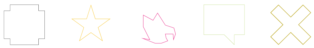
具体应用
在掌握了上述的方法后,我们就可以利用这个方式,实现各类不规则图形的边框效果,我们只需要传入对于的 clip-path 参数以及我们想要的边框长度即可。
好,这样,我们就能实现各类不同的不规则图形的边框效果了。
像是这样:
div {
    position: relative;
    width: 200px;
    height: 200px;
    clip-path: polygon(var(--clipPath));
    --clipPath: 0% 15%, 15% 15%, 15% 0%, 85% 0%, 85% 15%, 100% 15%, 100% 85%, 85% 85%, 85% 100%, 15% 100%, 15% 85%, 0% 85%;
    --borderWidrh: 1;
    --color: #000;

    &::before {
      content:"";
      position:absolute;
      inset: 0;
      mask: paint(borderDraw);
      background: var(--color);
    }
}

div:nth-child(2) {
    --clipPath: 50% 0%, 61% 35%, 98% 35%, 68% 57%, 79% 91%, 50% 70%, 21% 91%, 32% 57%, 2% 35%, 39% 35%;
    --borderWidrh: 2;
    --color: #ffcc00;
}
div:nth-child(3) {
    --clipPath: 90% 58%90% 58%, 69% 51%, 69% 51%, 50% 21%, 50% 21%, 39% 39%, 39% 39%, 15% 26%, 15% 26%, 15% 55%, 15% 55%, 31% 87%, 31% 87%, 14% 84%, 14% 84%, 44% 96%, 44% 96%, 59% 96%, 59% 96%, 75% 90%, 75% 90%, 71% 83%, 71% 83%, 69% 73%, 69% 73%, 88% 73%, 88% 73%, 89% 87%, 89% 87%, 94% 73%, 94% 73%;
    --borderWidrh: 1;
    --color: deeppink;
}
div:nth-child(4) {
    --clipPath: 0% 0%, 100% 0%, 100% 75%, 75% 75%, 75% 100%, 50% 75%, 0% 75%;
    --borderWidrh: 1;
    --color: yellowgreen;
}
div:nth-child(5) {
    --clipPath: 20% 0%, 0% 20%, 30% 50%, 0% 80%, 20% 100%, 50% 70%, 80% 100%, 100% 80%, 70% 50%, 100% 20%, 80% 0%, 50% 30%;
    --borderWidrh: 3;
    --color: #c7b311;
}
得到不同图形的边框效果:
又或者是基于它们,去实现各类按钮效果,这种效果在以往使用 CSS 是非常非常难实现的:


至此,我们再一次利用 CSS Painting API 实现了我们过往 CSS 完全无法实现的效果。这个也就是 CSS Houdini 的魅力,是 JS In CSS 的魅力。
兼容性?
好吧,其实上一篇文章也谈到了兼容问题,因为可能有很多看到本篇文章并没有去翻看前两篇文章的同学。那么,CSS Painting API 的兼容性到底如何呢?
CanIUse - registerPaint[12] 数据如下(截止至 2022-11-23):
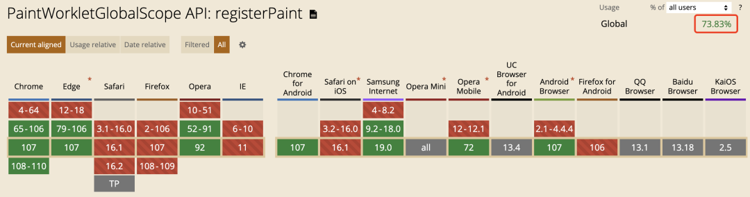
CSS Houdini 虽然强大,目前看来要想大规模上生产环境,仍需一段时间的等待。让我们给时间一点时间!
最后
好了,本文到此结束,希望本文对你有所帮助 :)
如果还有什么疑问或者建议,可以多多交流,原创文章,文笔有限,才疏学浅,文中若有不正之处,万望告知。
参考资料
[1]现代 CSS 之高阶图片渐隐消失术: https://juejin.cn/post/7167160342101884935
[2]现代 CSS 高阶技巧,像 Canvas 一样自由绘图构建样式!: https://juejin.cn/post/7168984450230353950
[3]现代 CSS 高阶技巧,完美的波浪进度条效果!: https://juejin.cn/post/7170868201645932551
[4]CSS 对象模型: https://developer.mozilla.org/zh-CN/docs/Web/API/CSS_Object_Model
[5]CSS Painting API Level 1: https://drafts.css-houdini.org/css-paint-api/#paintworkletglobalscope
[6]有意思!不规则边框的生成方案: https://github.com/chokcoco/iCSS/issues/106
[7]CSS 奇技淫巧 | 巧妙实现文字二次加粗再加边框: https://github.com/chokcoco/iCSS/issues/145
[8]CodePen Demo -- 3 ways to achieve unregular border: https://codepen.io/Chokcoco/pen/oNyyNQd
[9]CodePen Demo -- CSS Hudini & Unregular Custom Border: https://codepen.io/Chokcoco/pen/MWXXYgJ
[10]CodePen Demo -- CSS Hudini & Unregular Custom Border: https://codepen.io/Chokcoco/pen/KKeROeX
[11]CodePen Demo -- https://codepen.io/Chokcoco/pen/ExRLqdO: https://codepen.io/Chokcoco/pen/ExRLqdO
[12]CanIUse - registerPaint: https://caniuse.com/?search=registerPaint
[13]Chromium: https://www.google.com.hk/search?newwindow=1&rlz=1C5GCEM_enCN988CN988&q=Chromium&spell=1&sa=X&ved=2ahUKEwi3he2ensL7AhVaSmwGHdnzBxgQkeECKAB6BAgoEAE